Forgot password?  |  Register  |    
User Name:     Password:    
Blog - General Entry   

Dev Blog #4: Logo! - Updated!


On 06/08/2015 at 09:56 AM by PixlBit Studios

See More From This User »

Rather than bringing you the latest in our scheduled line of dev blogs, here's an off-topic one with the specific intent of showing off the new logo. I think it came out pretty alright and I hope you guys like it too. Let me know what you think!

PixlCross Logo

EDIT:

So, Chessa decided that we needed to bring the green back, so I updated the logo again, and I continued the little visual interest line in the Pixl part of the logo over to Cross. Let me know what you think of the changes!

PixlCross Logo

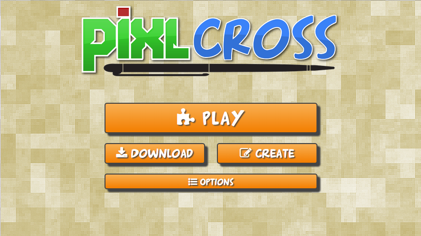
And here's a shot of the logo on the menu screen for the game:

PixlCross Logo


Comments

Cary Woodham

06/04/2015 at 07:24 AM

Oh neat.  I always like to put a logo title like that in my reviews.

Just a couple of ideas to bounce around to you: what if you made the pen look more like a stylus pen (at least on the Wii U)?  Or maybe put an exclamation point at the end of 'cross' to make it sound more exciting!

It's fine the way it is, though.  I was just thinking of other ideas.

mothman

06/04/2015 at 10:28 AM

I like it!

Matt Snee Staff Writer

06/04/2015 at 11:20 AM

Needs more nudity.  Just kidding.  It looks great!  Though I do like Cary's idea to put an exclamation point in there.  

KnightDriver

06/04/2015 at 04:29 PM

Does a word puzzle game really need an exclamation point? Is there some crazy action elements in it? Maybe crossed with Fruit Ninja and fruit flying everywhere? Just saying. I like it as it is. Maybe a boxed outline (not sure the term for that) around it in the design of the tables in the game maybe?

Alex-C25

06/04/2015 at 09:04 PM

Quite like it. i love the fact that the Pixl over there is the same in our site logo :P

Jamie Alston Staff Writer

06/05/2015 at 10:05 AM

I like it.  It looks refreashing.

Joaquim Mira Media Manager

06/05/2015 at 10:28 AM

Looks good.

Joaquim Mira Media Manager

06/08/2015 at 01:11 PM

The green does make the title stand out better on the menu screen.

Cary Woodham

06/08/2015 at 07:27 PM

The orange was neat because it matched the PIxlbit web site logo, but I like the green, too, because green is my favorite color!

KnightDriver

06/11/2015 at 01:48 AM

Looking good!

Travis Hawks Senior Editor

06/28/2015 at 09:59 AM

It look sharp!

Log in to your PixlBit account in the bar above or join the site to leave a comment.

Following

Game Collection

Support

Friend Codes