


Any SEGA Master System game box art was bad. :)
RETROspective: Videogame Box Art Part 1: The Worst

|
On 06/24/2016 at 10:27 AM by The Last Ninja See More From This User » |
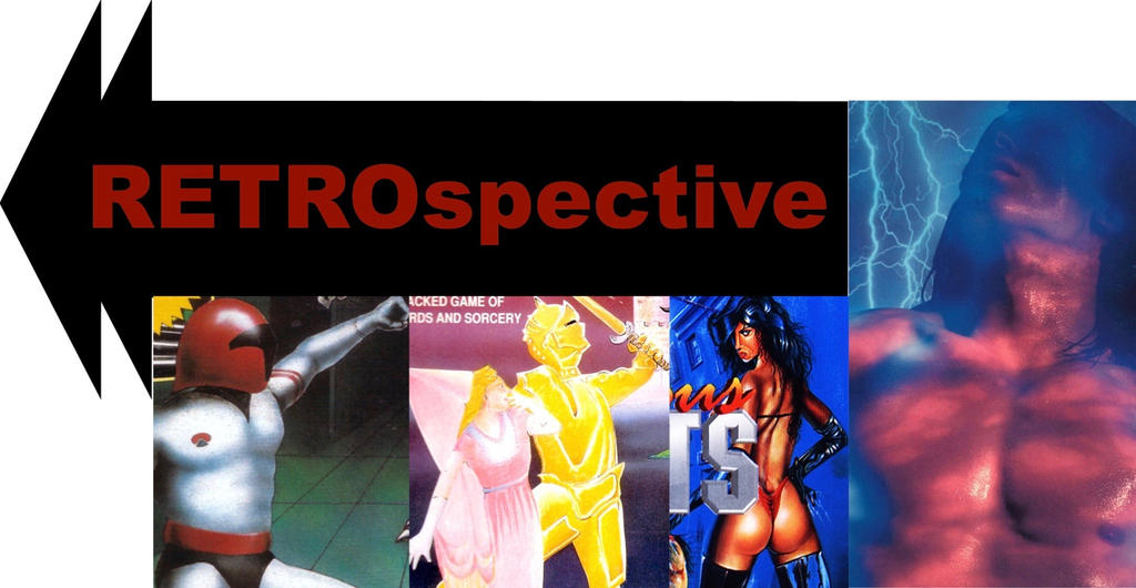
A look back at the VG boxes that made us cringe
Younger gamers may not understand this, but back in the day, box art was very important. Many times the cover on the box was the only thing to go on, so, if it was awesome, you wanted to try out the game. Or if it looked terrible, you wanted to stay away from it. Box art was everything. Sometimes, however, good games had bad box art, and vice versa.
This summer-long series will allow us to look at three kinds of box art: the bad, the good, and the weird. We'll start with the worst box art. For this series, I browsed through hundreds of game covers spanning over three decades! There is some awful box art out there! But you don't have to take my word for it, you can see them for yourself! Be prepared to laugh, cry, and cringe at the worst videogame covers of all time. (Note: this is, of course, opinion-based, but you'll probably agree)
Boxing (Atari 2600, 1980)
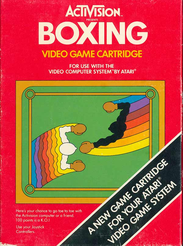
Most of Atari's sport games featured illustrations, but this one just showed you the two sprites duking it out. Bare-bones indeed.
Spider-Man (Atari 2600, 1982)

Who thought this was a good cover? Spider-Man is falling to his death with his butt towards the camera as the Green Goblin gloats overhead. Way to make the hero look pathetic!
Impossible Mission (Master System, 1984)

Is it just me, or is every one of this guy's poses a little creepy and suggestive? Especially that last one. I know this is supposed to look cool, but it comes off as rather lame.
My Hero (Master System, 1986)

Sega had a terrible habit of making their covers even smaller by showing the chip on it. I don't want to see some dude's hand! To make things worse, the picture on this chip is just dumb.
Secret Quest (Atari 2600, 1989)
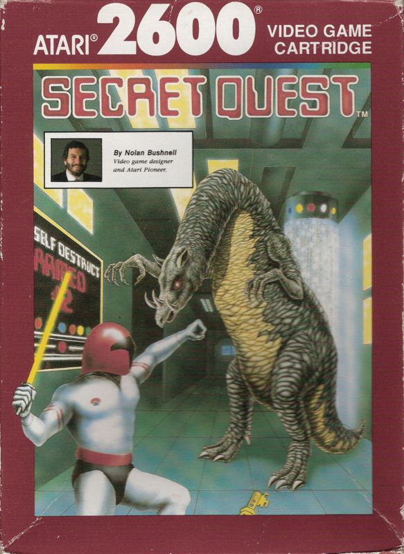
The alien and the space guy both look ridiculous, but wait. . . is he seriously gonna punch that thing in the gut? Good luck, buddy.
Castle of Dragon (NES, 1989)

Holy bright colors, Batman! The pee-yellow suit simply looks atrocious, but the fair maiden doesn't look much better. And look at the dragon's expression! Someone tried a little too hard.
Isolated Warrior (NES, 1991)

I know this guy thinks he's so cool, but he doesn't realize he's wearing an outlandish pink suit of armor! And what is that thing in the background? It's all a little too much.
Wonder Boy (Game Gear, 1991)
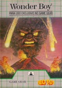
So this is Wonder Boy? Hm. . . . where's Wonder Boy on the cover??? It's just a really ugly erupting volcano which looks like the wolfman!
Phalanx (SNES, 1991)

"The hyper-speed shoot-out in space," says the cover. So why are we seeing an old hillbilly having a late-night banjo session? Who thought this was a good idea???
Columns III (Genesis, 1993)

The real-life balding man sitting on a stash of cartoon jewels. . . it just looks silly (which really goes against Sega's "super cool" attitude of the Genesis days).
The Lawnmower Man (Sega CD, 1993)
%20(Front).jpg)
I know this is based on the movie, but could they not get a better cover image? This guy's face is just freaky and a complete turn-off!
Road Avenger (Sega CD, 1993)

I don't know what's worse, this guy's huge leather-clad fist or his outrageous expression and mohawk! Either way, it's far too extreme (Oh, '90s).
Generations Lost (Genesis, 1994)
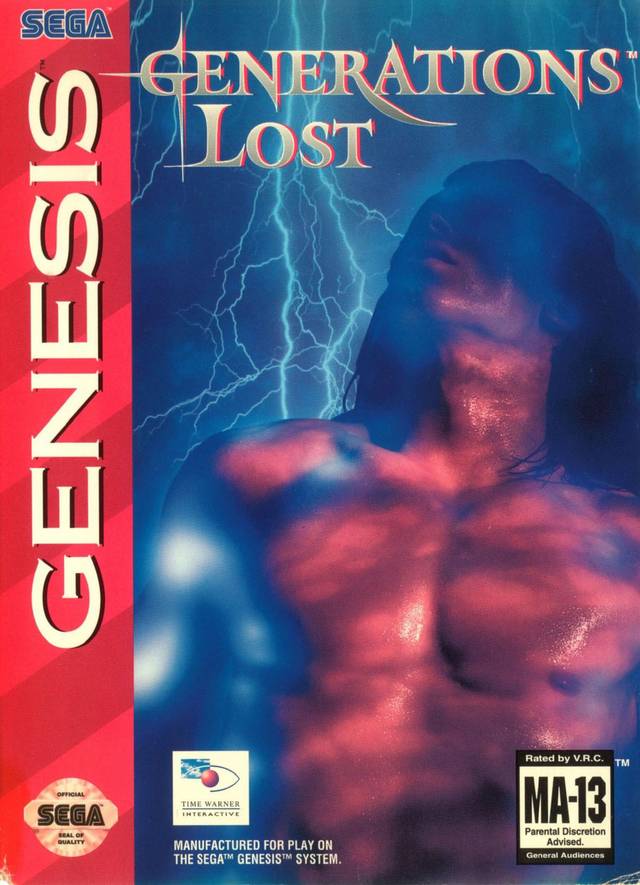
What's going on with this bare-chested guy? Is he being struck by lightning? Oh, I get it: he's lost. And so are we on this awful cover!
Dangerous Streets (Amiga CD32, 1994)

Let's see. . . we have a guy with glowing fists, a nearly naked woman, and a guy having a seizure. All of it comes together in a truly gruesome fashion.
Hell: A Cyberpunk Thriller (3DO, 1994)

This cover has a group of naked people falling into a Jaws-like hell hole. If that's not bad enough, these people look like action figures, which makes the whole thing look more ludicrous.
Forsaken 64 (Nintendo 64, 1998)
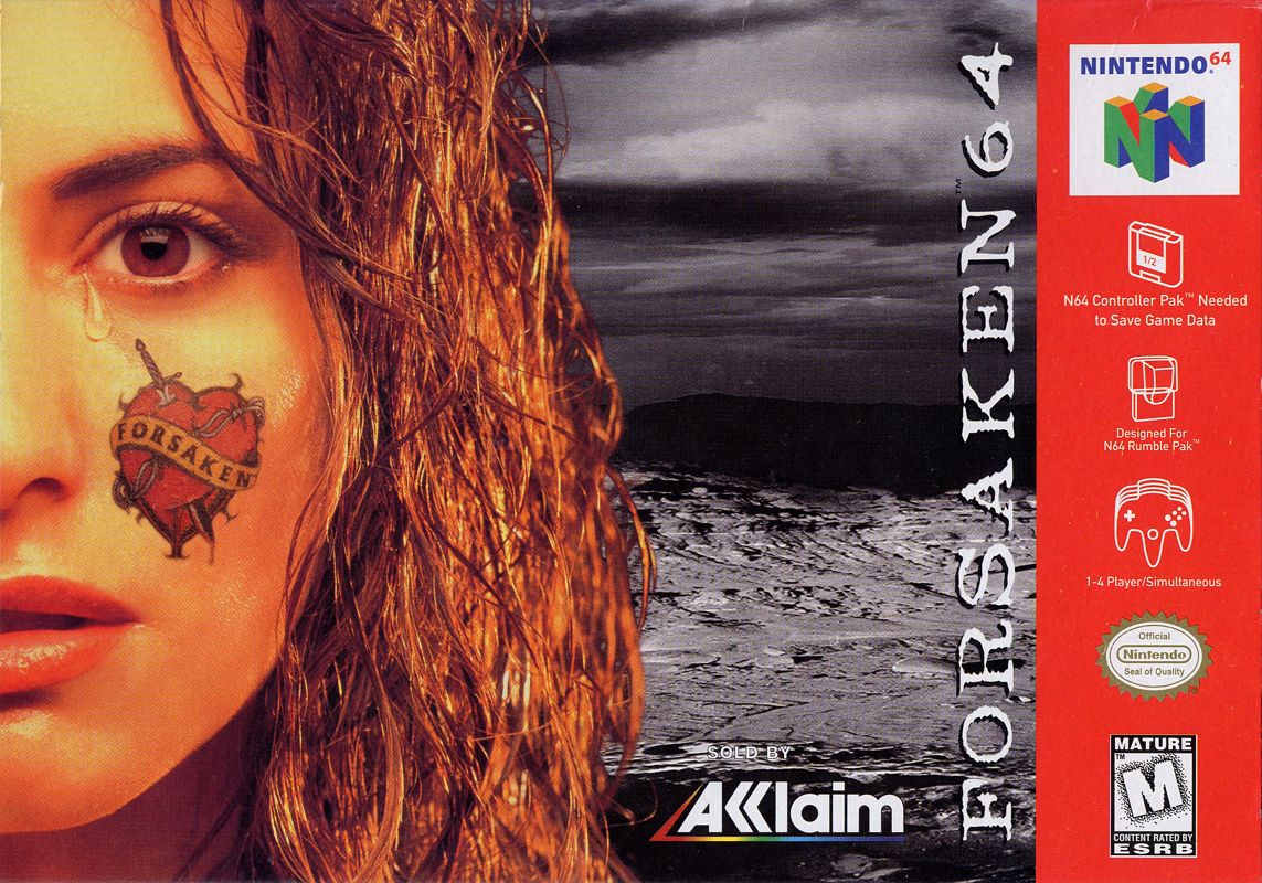
Hm, random woman with a tear coming down her face and a very blatant "forsaken" tattoo on her cheek. . . they really didn't know what to do for this cover.
Fatal Frame (Playstation 2, 2001)

There's a lot of heads in this cover. And why is the big head in the front upside down? What's he looking at? Maybe they, too, were not sure what to do for the cover.
Karnaaj Rally (Game Boy Advance, 2002)

Did the car here just smack this guy in the head? Maybe that's why he has that retarded expression on his face. Or maybe they accidentally got his face in the shot and were just too lazy to fix it.
Pandemonium! (Sega Saturn, 1996)
/Pandemonium!%20(U)%20Front.jpg)
Yikes, these guys are wearing some garish outfits! I don't think they missed any colors. The jester looks like he's having fun, but the lady looks quite serious. Maybe the title should've been "Pandemonium?"
Street Racer (Sega Saturn, 1996)

Seriously. Every person in this cover looks ridiculous! I'm sure they were going for goofy characters, but these guys are just awful.
And that's it! Hope you enjoyed these. Next month we'll look at the best, so stay tuned.


Comments