


I like that Panic Restaurant one. Who's the carrot? Hubba hubba.
RETROspective: Videogame Box Art Part 3: The Weirdest

|
On 08/19/2016 at 10:05 AM by The Last Ninja See More From This User » |

Get ready to scratch your head at these bizarre VG covers
Back in the day, VG box art was very important, certainly more than it is today what with the internet and all to decide for us whether a game is worth a purchase or not. If you missed out on the first two parts, click below to enjoy those.
We've now come to the weirdest game covers. I've scoured through hundreds (maybe thousands) of game covers to find just the right ones. These are the ones in which you look at them and say, "What were they thinking?" These either don't make sense, are so bizarre it's funny, or simply miss the mark of what the game is all about. The good news is that many of these are laugh out loud funny; seriously, you might fall out of your chair, so please be careful. I've narrowed this list down to 20 weird and wacky covers. Feel free to share your own covers if you have some truly strange ones. Now. . . enjoy!
Othello (Atari 2600, 1980)
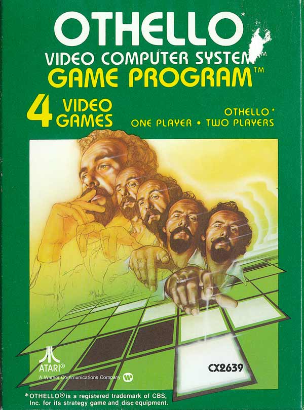
I know what they're going for, but it really just looks like this guy has five heads. Freaky. He's also pointing creepily right at you.
Mr. Do! (Atari 2600/Colecovision, 1983)
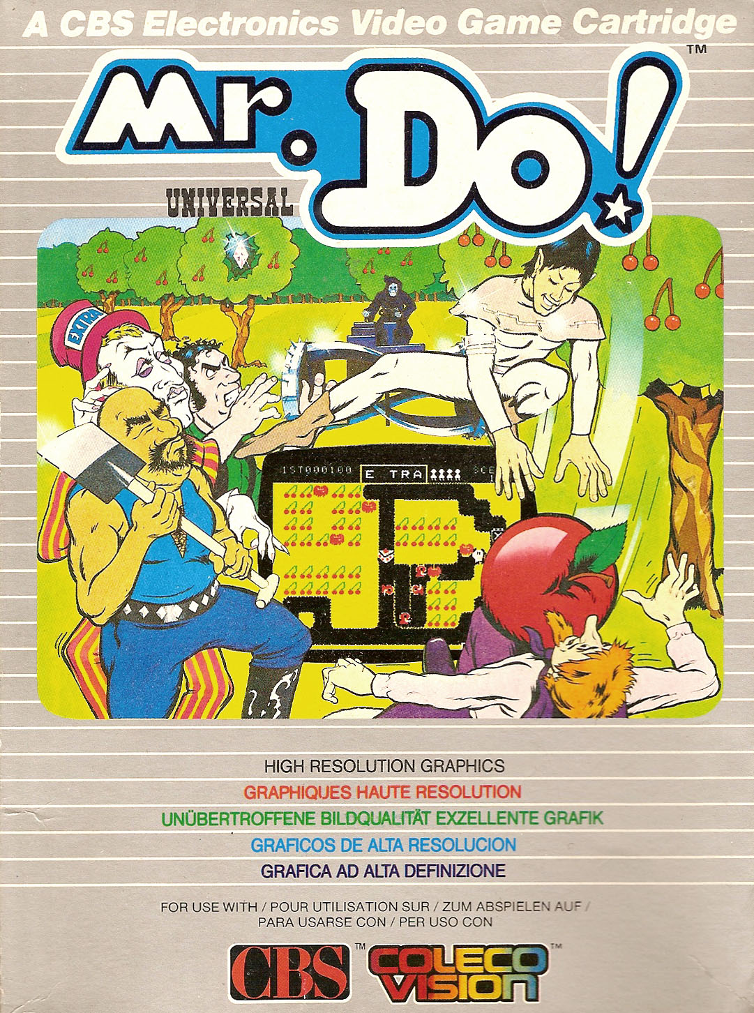
Not only are these characters really goofy, but is he dropping a giant apple on that guy? Also, the dude in the tophat has had a few too many drinks.
Frankenstein's Monster (Atari 2600, 1983)

This one's okay. . . wait a second. Isn't Frankenstein's monster supposed to be green? And why does his face resemble that of an old hippy? Somebody didn't know their monsters...
Attack of the Mutant Camels (C64/Atari 5200, 1983)
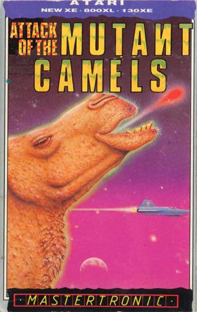
I don't think anything needs to be said about this one. Just. . . who came up with this???
Jumpman Junior (C64/Atari 5200/Colecovision, 1983)
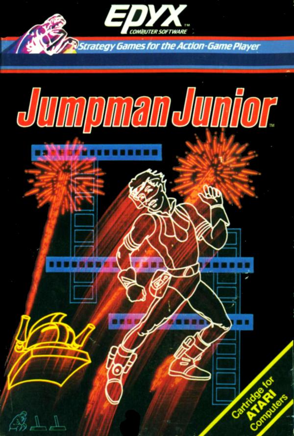
The fireworks and bright neon colors are a little disorienting. Also, Jumpman Junior is not even jumping in this cover!
Megamania (Atari 5200, 1983)

Let's see, a giant upside-down head, a bowtie dangling from his neck, and TV screens in his glasses. Oh yeah, and there's a tiny cat here too! What kind of cover is this?
Mega Man (NES, 1987)

Ah yes, the most infamous box art of all time. For some reason, the artist drew a Persian guy for this game about a little blue robot. To make it worse, this colored pencil sketch looks like an amateur drew it!
Wonder Boy III: The Dragon's Trap (Master System, 1989)

This cover is just goofy and weird. The hero looks like he doesn't know what he's doing, yet the monsters are afraid of him?
Gaiares (Genesis, 1990)

Yikes, this one is ugly! The bright colors suck any amount of cool out of it, and the monsters on each side just look laughable.
Saint Sword (Genesis, 1991)

Any amount of epicness is stolen from this cover due to the yellow stream of light which makes the monster in the back look even worse than it already is! Plenty of bright colors to go around.
Panic Restaurant (NES, 1992)

I'm pretty sure this chef wants to murder someone. Also, he looks kinda like Mario, which further makes this one weird.
Fire & Ice (Amiga CD32, 1992)
_01.jpg)
Seriously, does this guy look like Cool Coyote? More like Dorky Coyote!
Space Pirates (3DO, 1992)

LOL!!! Those space pirates are so terrifying! (not)
Mean Arenas (Amiga CD32, 1993)

This guy's face is only slightly creepy. . . I mean, is he a fighter or a model?
Dragon's Revenge (Genesis, 1993)

Apart from having the most generic title ever, this cover also has a woman who is not sure about that big silver ball. Perhaps the dragon startled her?
White Men Can't Jump (Jaguar, 1995)

This might be the most racist title in videogame history! Also, they don't even have a white guy on the cover! C'mon, Atari.
Tempo (Sega 32X, 1995)

This is just plumb weird. This radical kid with big white sneakers is kicking an octopus monster with horns? Now I've seen everything!
Virtual Chess 64 (N64, 1998)

Could they have an uglier cover? The fat ugly black queen is about to club the skinny ugly white queen with (what appears to be) a fish? Goofy this is not; it's awful!
Who Wants to Beat Up a Millionaire (Dreamcast, 2000)
.jpg)
Yikes, this might be the most violent cover I've ever seen. Who approved such a concept as pulverizing rich dudes? And what a face!
Urban Yeti (GBA, 2002)

As if this cover isn't weird enough, the look on the yeti's face is one of great horror as he realizes that he's finally been caught in a photo!


Comments